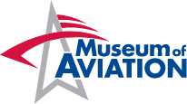
Museum of Aviation Brand Guidelines
The following Branding Guidelines must be always followed when using the Museum of Aviation, Museum of Aviation Foundation or the National STEM Academy logos when creating all marketing materials, updating the website, blog content, and publishing on all forms of social media. If the logo cannot be used, all other Core Brand Concepts should be included in the publication or product for brand consistency. All branding guidelines must be adhered to unless prior approval has been received by the Museum of Aviation Foundation Graphic Designer and/or the Museum of Aviation Foundation Director of Operations. The National STEM Academy is a registered trademark of the Museum of Aviation Foundation. All marketing must retain the core brand concepts and represent the Museum of Aviation with respect.


Logos & Usage
All logos and branding concepts are to reflect the Museum of Aviation’s Mission and Vision:
- VISION: Recognized as a world-class aviation museum in the Southeast United States.
- MISSION: Inspire and educate by preserving the heritage of the United States Air Force through public engagement and a superior visitor experience.
Usage
Do not alter any of the logos in any way by not allowing adequate space around the logo, improperly resizing the logo, changing logo font or by using a color not specified below. Logos should not be shadowed or shaded. No other version is to be used without prior approval. Improper usage of the Museum of Aviation, Museum of Aviation Foundation or National STEM Academy name and logo are prohibited by law.
Clearspace
- There should be sufficient clear space around the logo to prevent its clarity and visual impact from being obstructed.
- The logo should also be in front of any other background imagery.
- No part of the logo should be covered or obstructed by any other text, shape, or imagery.
Sizing
- Should be legible at any size. Do not use full logo unless there is ample space to allow for legibility.
- Do not stretch or distort. Logo should always be sized proportionally horizontal to vertical.
Versions
- All logos should be used in their entirety unless prior approval is obtained for special or specific projects by department Director.
- The National STEM Academy logo is a combination mark consisting of an image (gear) and text (name, company, tagline).
- Logos are available in JPEG, PNG, EPS and PDF formats. No other version is to be used without prior approval.
Color Palette
Logos should only be used in original colors or solid white or solid black. No other color palette will be acceptable unless with prior approval from department Director.
- Colors should never be reversed or switched. If another accent color is needed for aesthetic value, only the approved Gray listed below should be used. Logo should never be used in Grayscale. Full color, solid black, or solid white are the only approved colors unless prior approval from department Director.
- Colors in designs, publications, etc. that clash or make the logo look unpleasing should never be used in conjunction with the full color logo. Use black or white logo instead.
Primary Colors: The logo is comprised of three primary colors.
Secondary Colors: Our secondary palette is made up of colors that balance and complement the primary palette. These tones are used to add flexibility but should be used sparingly so as not to detract from the primary brand colors. Logos should always maintain use of primary palette colors.
Primary Colors
|
HEX: #D21241 RGB: 210,18,65 CMYK: 12,100,73,2 |
HEX: #004890 RGB: 0,72,144 CMYK: 100,81,14,2 |
HEX: #FFFFFF RGB: 255,255,255 CMYK: 0,0,0,0 |
HEX: #AEAFB3 RGB: 174,175,179 CMYK: 33,26,24,0 |
Secondary Colors
|
HEX: #01376E RGB: 1,55,110 CMYK: 100,86,31,18 |
HEX: #B3C9DF RGB: 179,201,223 CMYK: 29,13,5,0 |
HEX: #000000 RGB: 0,0,0 CMYK: 75,68,67,90 |
HEX: #E7E7E8 RGB: 231,231,232 CMYK: 8,6,6,0 |
Typography
Typography serves as an anchor that supports and unifies our brand. Its use allows our audiences to find familiarity in our messaging. Montserrat is a modern sans serif typeface that is used to deliver clear, confident messaging statements and echoes our approachable and strong brand attributes with its letterforms. This typeface is used in a prominent way for headlines, large intro copy, pull-quotes, and sidebars.
Roboto is a highly readable typeface and is used to support our primary headline typeface. It is used for subheads and other supporting text such as body copy, subheads, excerpts, captions and data.


